Building the biggest little brand for everyone’s favourite little potatoes.
the challenge
big growth for little potatoes
Over the past 25 years, The Little Potato Company has grown from selling at farmers’ markets to becoming a multi-million-dollar company selling in major retailers across North America. When they came to ZGM, new competitors were entering the market and sales were starting to plateau. Together we recognized that their current audience—foodies and people cooking for special occasions—didn’t fit their growth goals. We needed to reposition their brand to make Little Potatoes an everyday pantry staple for families.
creating little moments of happiness for busy families
Before starting any design or writing, we created a brand platform that served as the foundation for everything to come. Extensive qualitative and quantitative research helped us refine The Little Potato Company’s brand purpose and values, as well as create their new brand positioning: Creating little moments of happiness for busy families. That positioning informed new brand pillars, key messaging, and tone of voice.
With the brand platform in place, it was time to bring The Little Potato Company’s new brand to life—and start creating little moments of happiness.
visual identity
designed for happiness
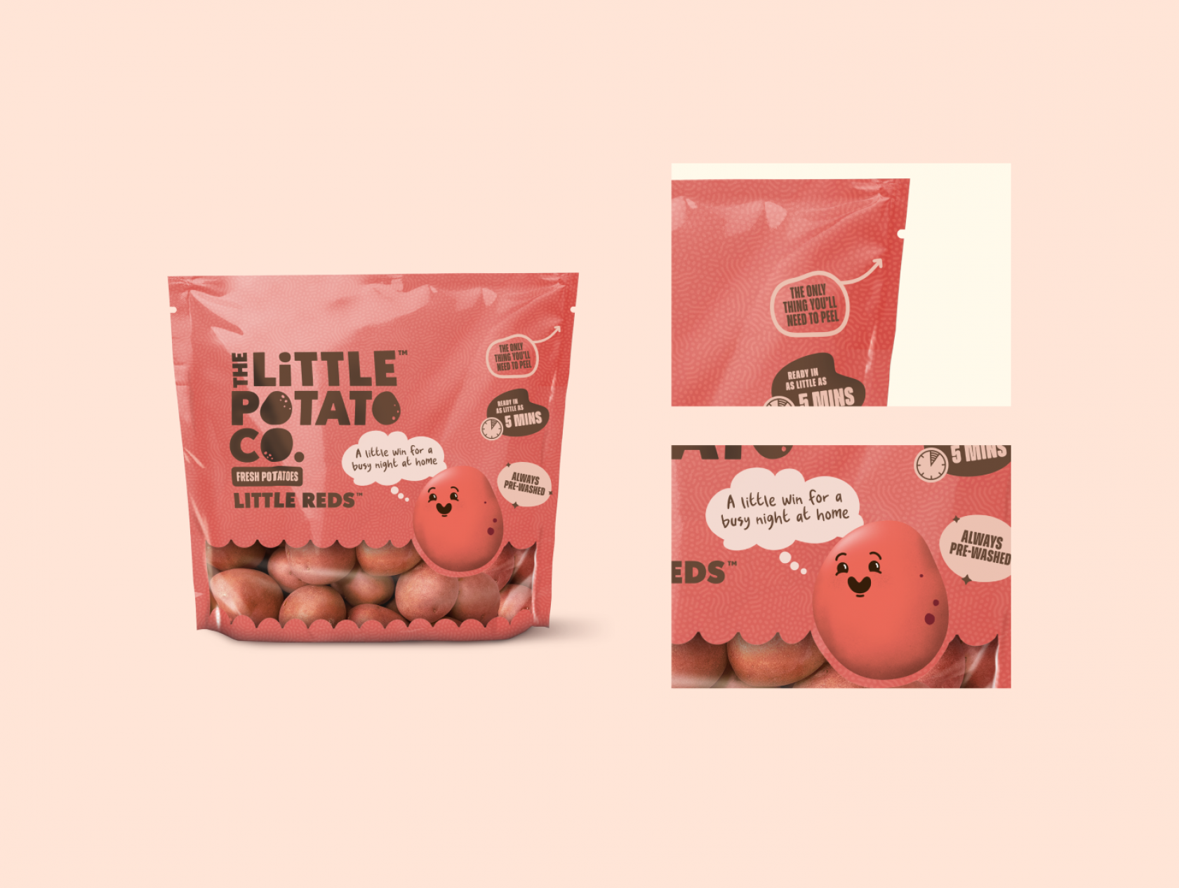
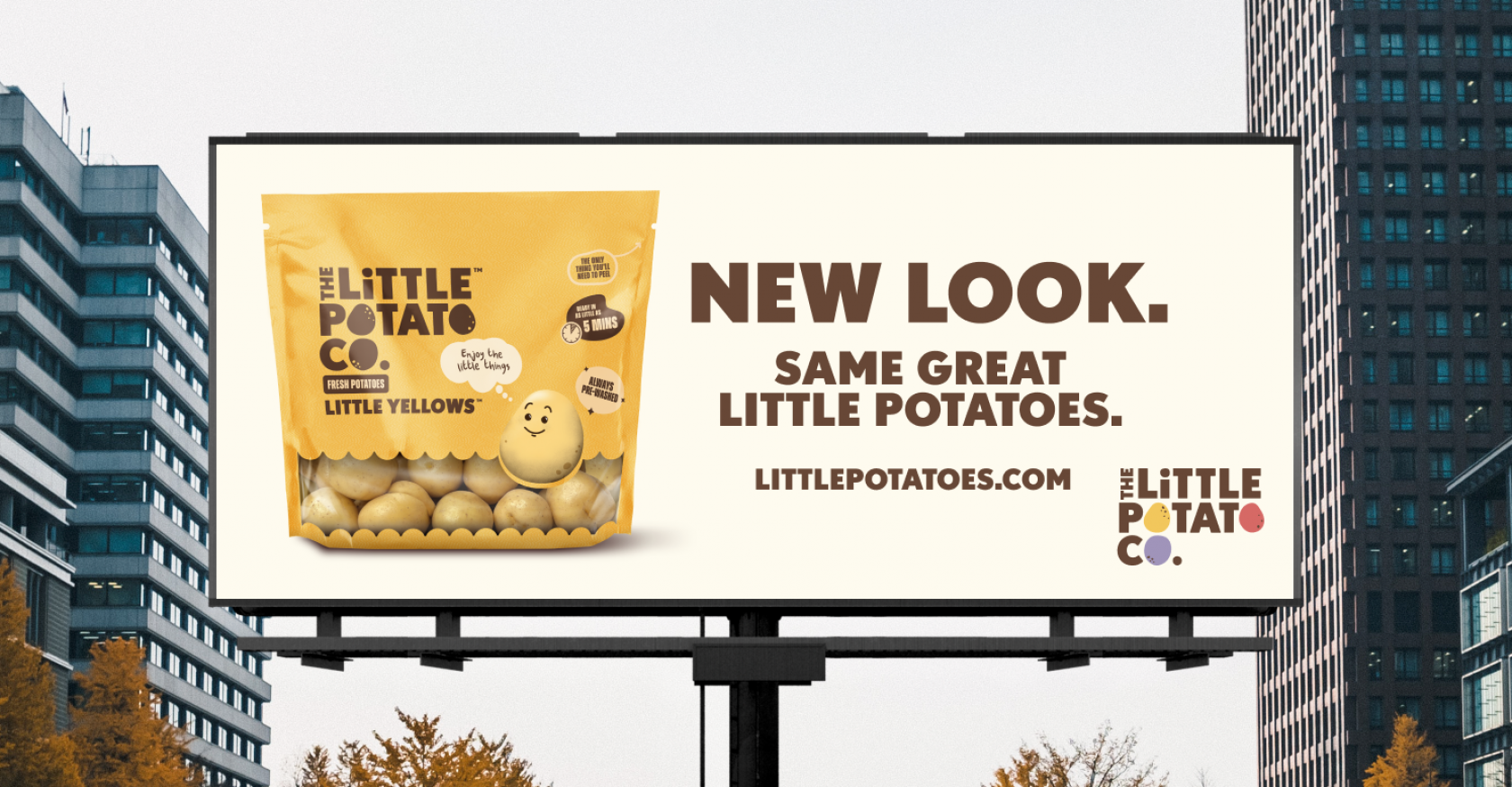
The Little Potato Company’s new visual ID brings dozens of elements together into one cohesive whole—all designed to create little moments of happiness. The logo went from having a premium feel to a quirky, bouncy and bold logo that would be instantly recognizable anywhere. We built the logo to be animated in a fun way, inspired by classic cartoons to resonate with both parents and their children.
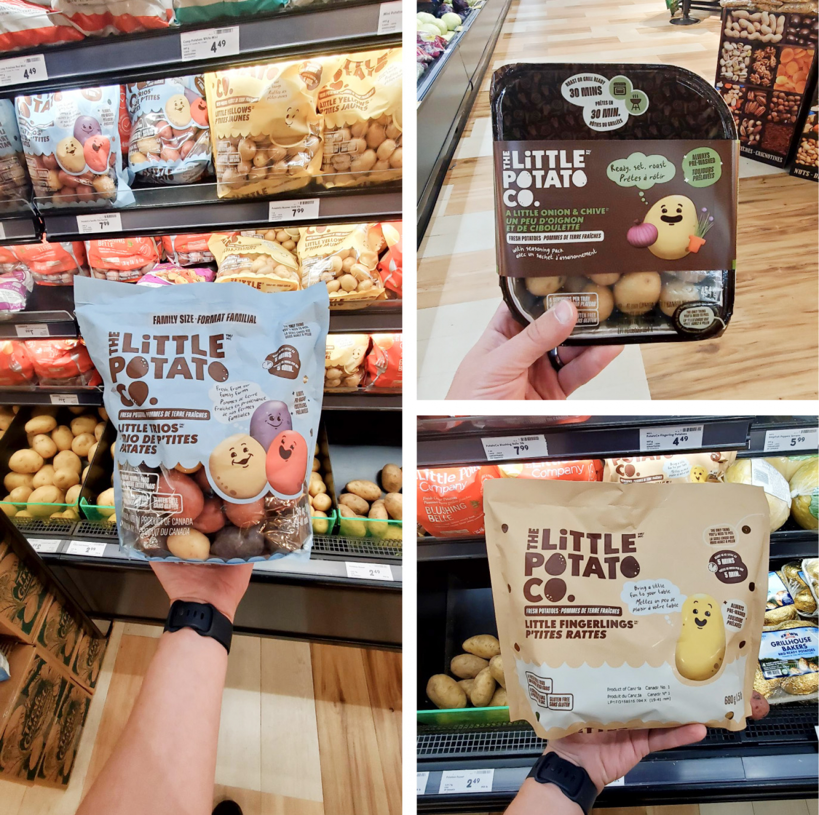
From there came a family-friendly series of packages, made to bring a little smile to consumers faces with fun and bright designs that stand out on shelves against competitors.
Our Little Potato Characters tie the whole brand together. These family-friendly, custom illustrated Little Potato characters are everywhere–from packaging and point-of-sale to advertising and social media.
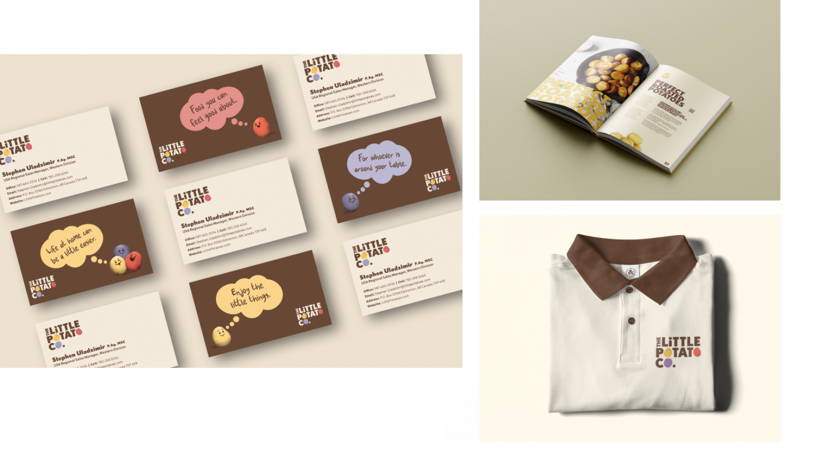
Extending the brand
our characters and beyond
Our main illustrated characters represent the three primary potatoes sold by the Little Potato Company, offering a friendly and positive face for the brand. They’re thoughtful Little Potatoes, always ready to offer a little bit of helpful, feel-good advice for time-starved, busy families. Beyond countless static applications, our characters come to life in animation, spread a little joy to everyone who sees them. They can even be integrated into the logo, popping in and out of it for commercials and branded videos.
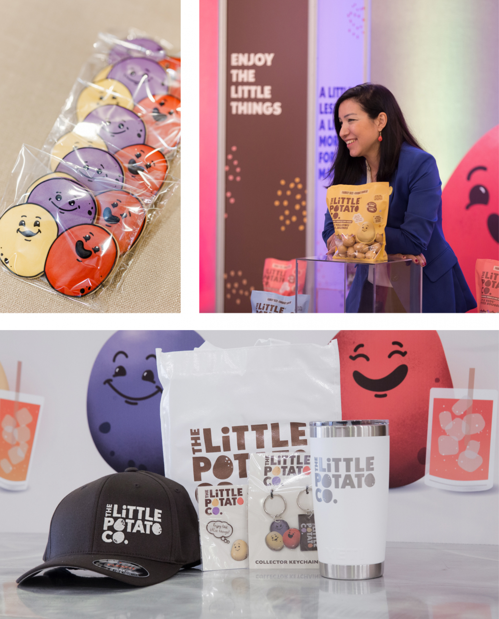
LAUNCH
little potatoes are going big
The Little Potato Company first launched their new brand with a series of energetic corporate events at their offices in Canada and the US, as well as major grocery retailing trade shows. Redesigned products soon hit the shelves, along with a strategic integrated launch campaign that came to life across digital display, OOH, social media and more. The campaign put key brand elements front and centre, showing off the new packages and letting our characters introduce new consumers to the brand pillars and messages that will help sales grow to new heights
After 18 months of collaborative work, The Little Potato Company had an international brand to drive their business forward—created in the same place it all started.
We bring little moments of happiness to life in every element of our new brand, from the colourful logo, to our characters, and our heartwarming ad campaign.